
01
What Does It Represent?
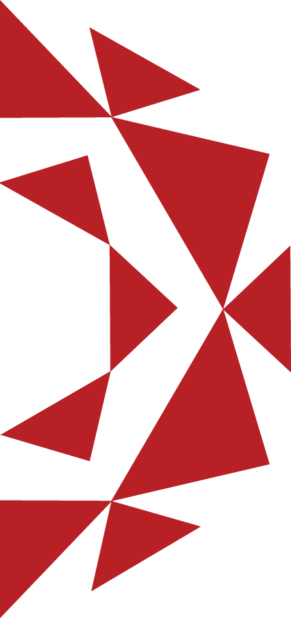
The philosophy behind our logo is centred on unity and distribution. The inward-facing triangles represent the brands within GÜL-PAŞ, while the outward-facing arrows symbolise products reaching customers through a powerful distribution network.
The overall geometry evokes the form of a rose, turning the GÜL-PAŞ name and our “A Happy Smile” approach into a distinctive visual identity.
02
The Meaning of Our Colours
Our corporate red represents dynamism and productivity, while graphite communicates trust, balance and professionalism. Together, they unite the energy of our field operations with our disciplined way of doing business.
GÜL-PAŞ Red
#b72025
Corporate Graphite
#616161