![]()
What Does It Represent?
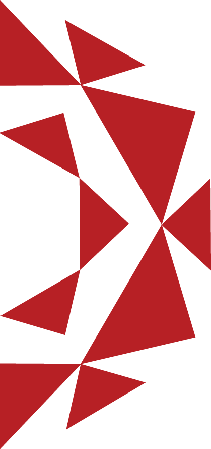
The philosophy behind our logo design is based on the concepts of unity and distribution.
The inward-facing triangular forms represent the brands within our company, while the outward-facing arrows symbolize distribution.
During the design process, inspiration was taken from the rose symbol.
A deep red tone was chosen to reflect dynamism and productivity, while charcoal gray was used as a supporting color to create a corporate and elegant impression.